
Rebranding is a crucial component of any company’s long-term and timeless marketing plan. These brands now have a new look and new things in store. However, the community will ultimately decide. Additionally, rebranding is comparable to walking on a thin sheet of ice. It is a situation where even a minor error can spell disaster. Here are some top brand rebranding announcements for 2023 from prominent companies.
7UP
![]()
The 7UP logo has been erratic in a pleasant way since its debut in 1929. At the same time, some enduring brands concentrate on incremental changes and the occasional overhaul. However, the design ethos of 7UP appears to have a long due change. Pepsico has revamped 7UP with a new visual identity after seven years. The new design also continues down the flat design path and provides the ‘7’ a thick extrusion that harmoniously ties into the company name and positioning. Additionally, it will be in use for 7UP and 7UP Zero Sugar. The new appearance also features the slogan “New Get Up, Same 7UP.”
Baskin Robins
![]()
Baskin Robbins, an iconic ice cream brand, has unveiled a new corporate look. The brand’s distinct humor, the certainty of superb taste, and high caliber also appear in the new logo. Baskin Robbins hopes to attract a younger audience with its new image. The logo also aims to provide customers with an exciting and captivating experience. Additionally, it has every element, including modern designs and fresh, vibrant colors. It highlights the brand’s quirky nature and fosters a friendly atmosphere. The brand’s pledge to offer 31 flavors—one for each day of the month—remains intact.
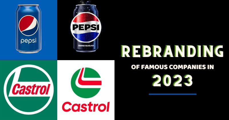
Pepsi
![]()
The packaging of some prominent companies is one of the things that are most deeply embedded in the American brain. Additionally, it is mainly the appearance and feel of the leading cola brands in the nation. Therefore, it is a big deal when a brand changes its logo. Pepsi has updated its logo for the first time in 14 years. The goal of the revamp, according to PepsiCo Chief Design Officer Mauro Porcini, is to create a visual identity. Additionally, it connects with current customers while honoring the brand’s past. Since it became available, the audience online has all hearts for the new appearance.
Nokia Rebranding
After a long time, Nokia unveils a new logo that seems like the brand has a new look in line with the digital transition. The rebranding of Nokia also aims to better convey the company’s innovative and cutting-edge business methods. In the process, this will help bring the brand into line with current fashion trends. Since the company’s founding in 1865 as a single paper mill operation, it has come a long way.
LG
![]()
A new visual identity for LG was out, featuring a flatter digital logo and the lighter LG Active Red. At first glance, the new logo for the IT company looks almost identical to the previous one. Additionally, advertisements and product packaging will use the brand tagline more frequently. It is written in a new typeface. LG aims for a more vibrant and youthful appearance as part of a reimagining brand identity. In addition, LG wants to give its famous logo on the web more personality. By using expressive gestures like winking, smiling, and nodding, they are doing this.
Castrol
![]()
Castrol unveils a brand-new logo with a contemporary look and feel. This revamp also seeks to better capture the company’s unique market positioning. Additionally, it illustrates the potential for adapting to clients’ changing needs. The new logo emphasizes its core advantages in a more contemporary, lively, and expressive manner. The traditional Castrol colors of red, green, and white are still visible.
Fanta
![]()
Fanta is another beverage company whose rebranding is making waves throughout the globe. It is also popular due to the original way it approaches advertising, which now looks great. The new design also includes brighter, more colorful, and more dynamic colors. With the iconic orange circle and green leaf gone, the wordmark has been modified and made more straightforward. The Coca-Cola global design team and the advertising firm Jones Knowles Ritchie are accountable for the rebranding. With a design that is unmistakably Fanta, it also hopes to make the mundane amusing and encourage people to find the fun in life.
We think that rebranding involves creating an entirely new brand, not merely changing the logo and visual identity. Additionally, a new company or product name is included. Up to now, this year has produced many excellent rebranding examples.
Follow Us: Facebook | Instagram | Twitter |
Youtube | Pinterest | Google News |
Entertales is on YouTube; click here to subscribe for the latest videos and updates.


